TOP 10 SERVICES INCLUDED IN A BRANDING PACKAGE. WHO NEEDS THEM?

#1 LOGO DESIGN

Logo and brand design are tightly intertwined since any logo is an inherent part of visual brand identity. Besides, a complete branding package almost always offers logo creation as one of its primary services.

Logo design is a perfect way to make your company noticeable among its competitors and lay the foundation for your future marketing success. Since its first days, a logo will build a strong association with your company and services. Hence, make sure to invest in its quality and design. Also, note that there are different types of logos to choose from.

You’ll have to design the most suitable option for your case. Regardless of whether you order a complete branding package or a separate item, a logo is a must. Ideally, the logo design should be created before both large or small business is launched.logo design for SF catering company01logo design for SF catering company
#2 COLOR PALETTE

If you are just launching a company or still haven’t selected your brand colors, ask to add this option to your branding kit. A color palette has a significant influence on your brand image and perception.

Moreover, this branding package service is necessary for any company interested in long-term development and high-quality marketing. Note that color selection is a crucial visual branding step, so make sure to entrust it to professionals.Color Palette02Color Palette
#3 EMAIL TEMPLATES

Nowadays, a huge number of business operations happen online. Hence, it’s almost impossible to keep the leading market position if you don’t use emails as one of your marketing channels.

This is especially true for those engaged in e-commerce. A branding kit of every online store would be incomplete without branded email templates.

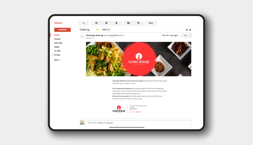
They turn your newsletters into a more powerful promotional tool and encourage recipients to take action. Therefore, don’t hesitate to use this branding package option if you send a lot of B2C or B2B emails and need to brand them.A branding kit of every online store would be incomplete without branded email templates03A branding kit of every online store would be incomplete without branded email templates
#4 WEBSITE

We know that websites aren’t the first thing associated with business branding packages. However, if you’re lucky to find a professional design agency, it may offer you website design as a branding kit option.

Moreover, it’s nice to have some branding elements on your official web page to promote your brand online. Even the most popular offline leaders need to work on their online presence to expand their target audience and promote their products. Thus, a stylish, convenient, and informative website is something any company cannot live without.

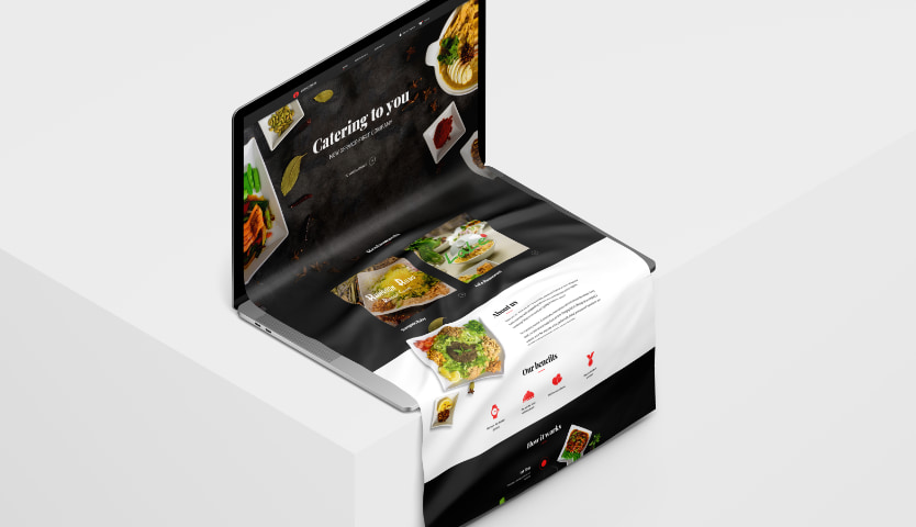
Check out a food provider’s website designed by The Coder to see how it combines several branding elements and promotes the services.Concept of website design04Concept of website design
#5 TYPOGRAPHY

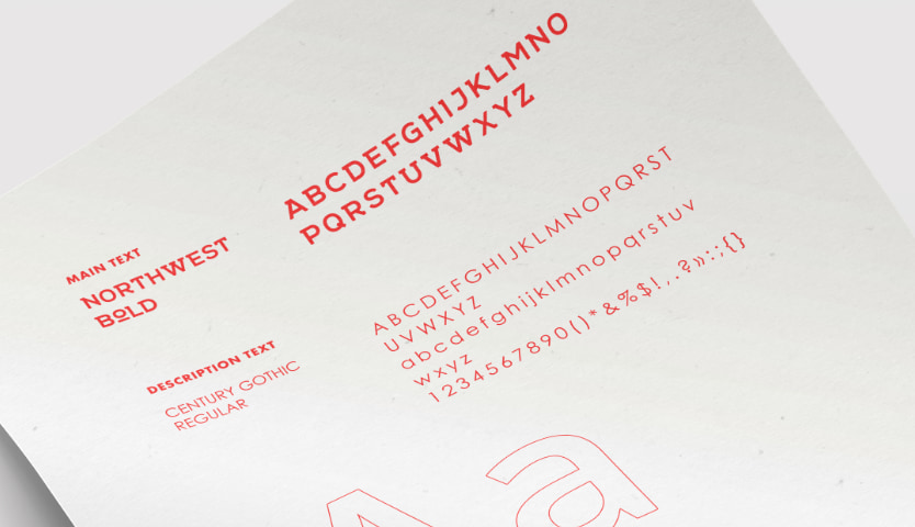
Let’s be honest, typography isn’t the most popular branding element, and many companies choose to ignore it. In most cases, they believe that font selection is easy and doesn’t require careful reasoning.

Only professionals know the power of typography and its impact on the overall perception of branding. Therefore, a full branding package includes typography as its key element supplementing others.

Unlike a large enterprise, a small business can do without customized fonts. Especially, if it doesn’t use a lot of titles or text content. Yet for seamless multifaceted branding experience, it’s better to design customized fonts.Typography one of the most branding element05Typography one of the most branding element
#6 LETTERHEAD

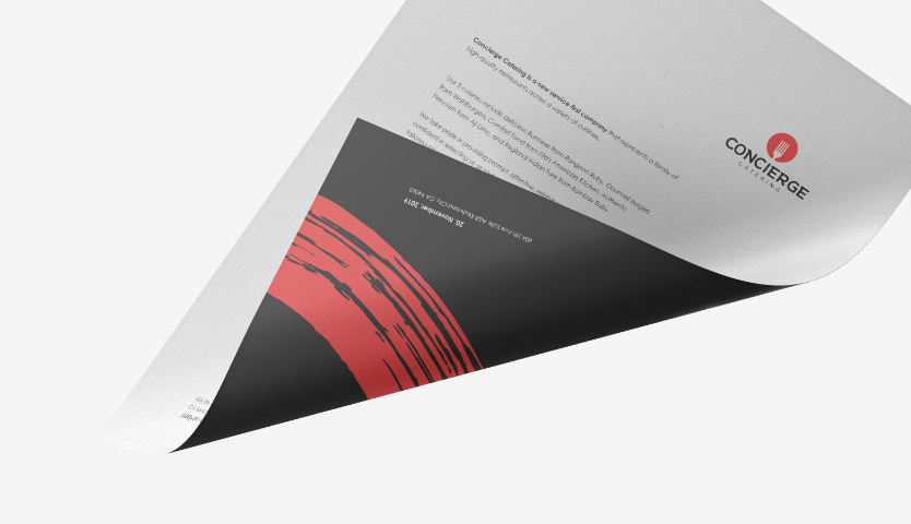
If you send a lot of email attachments or use direct mail marketing, make sure to design a customized letterhead. This package branding element will make your message more memorable and increase response rates.

It usually includes the name and address of a company placed on its brand colors at the top of the page. Creating a letterhead, it’s important to stick to your brand style and use the right proportions of the heading and blank space.Letterhead design for SF catering company06Letterhead design for SF catering company
#7 BROCHURES

Brochures aren’t included in all branding packages for an obvious reason. Therefore, if you want to start a direct mail campaign or distribute printed marketing materials through any other channels, discuss this directly with your design agency.

Most brochures contain the logo, slogan, services, advantages, and contact information of a company. This is a perfect mix that covers the informational needs of an average target audience. Professional designers will help you create a brochure that catches attention and presents your brand in the most appealing way. Also, this method is usually favored by a medium or small business that operates locally and bets on offline marketing.Mask Group 18807Mask Group 188
#8 BUSINESS CARDS

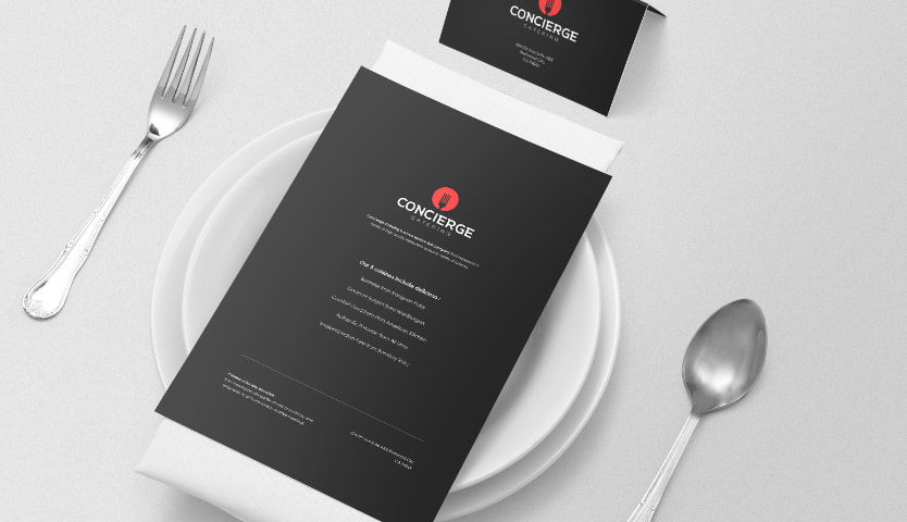
Most corporate identity packages offer business cards. Easy to design and cheap to print they play an important role in your visual brand identity. If you hire many people and need a similar business card design, the agency will provide you with a customizable template.

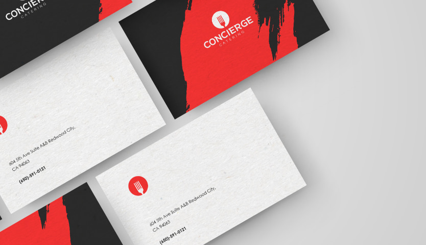
Your company size and type of services have absolutely no impact on the necessity to use business cards. Everyone should be able to easily share their contact information. So it’s better to order business card design along with other branding items.Business cards design for SF catering company08Business cards design for SF catering company
#9 PACKAGE DESIGN

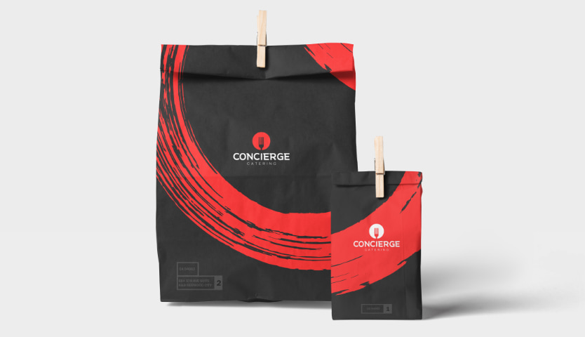
In some cases, a branding package heavily depends on a product package (Sounds pretty complicated, right?) Let’s clarify what we mean here. Package design is the look of all products that end consumers see in a shop or an online store. Want an example? The Coder has created branding that includes package design, for Concierge Catering. Click here to check out the final result.

Packages have a strong influence on the decision-making process. Furthermore, people often buy something only because they like its look. Thus, if you are a company that produces any mass-market product, you’d better entrust your product package to professionals. This will be a wise investment in the development of your company and a great way to stand among your competitors.Packaging design for SF catering company09Packaging design for SF catering company
#10 STYLE GUIDES

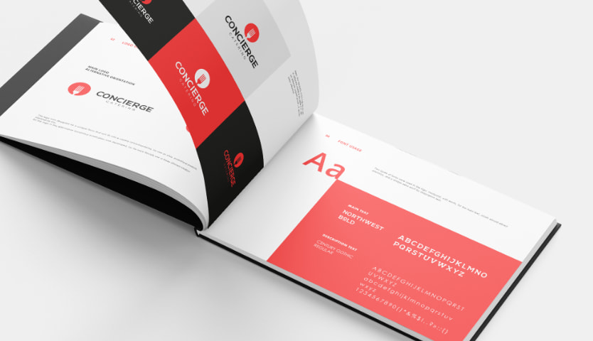
A style guide is a comprehensive rulebook with all specifications related to your brand. In particular, it will include your mission, vision, core values, company voice, logo, typography, and principles.

Style guides will come in handy to marketers, graphic designersweb developerssales team, and anyone who needs to present a unified vision of your brand to your target audience.

This type of branding package is most suitable for large market players willing to build a far-reaching marketing strategy.

The listed items aren’t neither canonical nor exclusive. Besides, they don’t necessarily have to be included in every branding package. This is a basis you can rely on to understand what visual branding can boost your marketing campaign. In some cases, it’s even better to refuse from a branding package in favor of separate branded items.

If you hire a design agency that is flexible and open for communication, there should be no problems with that. You will be able to select the required branding elements and find the optimum solution for your project.

The Coder covers all these branding package elements and even more. Contact us to discuss branding package prices for your business.A style quide is a comprehensive rulebook with all specifications related to your brand10A style guide is a comprehensive rulebook with all specifications related to your brand
The 9 Types of Logos & How to Use Them

Your business is all but ready to take off – now you just need to find the perfect logo to represent your brand.

If it’s doing its job correctly, your logo will create positive associations between your company and target audience, in the form of a visual cue. The question is, what type of logo will get the job done?

While a million decisions go into finding the right logo for your business (font, layout, images, color palette, etc.) we’ve compiled a list of the main types of logos to help make the logo-selection process painless – and fun!

There are 3 main logo categories: Images, words, and combinations. Below, you’ll read about 9 types of logos that fit into these groups.

#1. Brand Mark

Brand marks – or pictorial marks – are logos that are made up of a graphic symbol or icon, one that (usually) represents a real-world object. We’re talking something simple and straightforward, like the outline of a tree or a coffee mug. This object could tell the story of what your company does – think Youtube’s play button – or maybe play with your company name.

Advantages:

Brand marks are clean-cut and easy to remember. If you offer a specific service, an image representing that will send a quick, clear message to your audience.

Also, the simplicity of the design will translate well when resizing your logo across branding materials like business cards or letterheads.

What to consider:

Tread cautiously if you’re a new business or don’t yet have many followers. While a brand mark is often the hallmark of companies that could be considered iconic, you need to first be established enough to be recognized. Otherwise, your logo may not communicate enough about you to your audience, and they’ll lose interest in your brand.

Also, bear in mind that if you’re planning on expanding your product line to a few diverse objects, your logo may misrepresent what you do.

Inspiration: The Rolling Stones, Apple, Twitter.

#2. Abstract Logo Marks

Abstract logos are your conceptual, think-about-the-big-picture logos.

Like a brand mark logo, an abstract logo consists of just a symbol – but one that is tailor-made for you. This type of image doesn’t necessarily mimic an object that exists in real life; rather, it’s a unique logo that’s designed to express something specific about your brand.

Advantages:

There’s room to play with these, because you can design a logo that really communicates your values or something about your brand that you’d like to emphasize.

Because an abstract logo isn’t restricted to a real-world object or image, there’s a lot of wiggle room to say what you want about your company. Particularly if you’re a company that does several distinct things, a well-thought out abstract mark may be the perfect logo for you!

What to consider:

You’ll want to make sure that you refine the logo design until you’re sure you’re conveying the intended message to the world. Attention to detail is crucial with abstract logo marks, and you don’t want your message to be misconstrued with a logo design that’s too vague or hard to understand.  

Also, a logo with excessive detail in the design may not look the way you want when printed at different resolutions; therefore, consult with a logo designer that understands how fonts, colors and shapes interact.

Inspiration: Airbnb, Pepsi, Microsoft (Windows)

abstract logos

#3. Mascots

Arguably the most family-friendly type of logo, mascots are images of a character or person that act as a visual representation of your business. Think of them as your brand’s “spokesperson” – much of your advertising will be centered around them.

Advantages:

Mascots give their audience that warm-and-fuzzy feeling, which leads to creating a distinctly memorable brand. Also, nothing appeals to kids more than a physical, tangible character that they can relate to.

And, while you may empathize with the guy standing outside a seafood restaurant waving the arms of a 6’2 lobster costume as he sweats desperately in the August heat, your kids are likely to go crazy over him and beg you to eat there.

Just some food for thought. (See what I did there?)

What to consider:

Realize that Mascots may not send the right message if your company’s focus is global innovation or disrupting the pencil industry – or, of course, marketing a product that isn’t child-friendly.

Case in point – Camel cigarettes ran a ten-year advertising campaign based on their mascot, Joe Camel (also known as Old Joe). However, they had to pull the campaign in 1997 while facing an impending lawsuit that accused the company of using Old Joe to target children – evidenced by a $470 million increase in cigarette sales to teenagers since the campaign started.

Moral of the story: If you’re a company selling cigarettes – don’t try to promote to kids. Just don’t.

Companies like Pillsbury, on the other hand, are perfectly represented by their wholesome, doughy – I mean, well-rounded – mascots (pictured below).

Inspiration: The food industry – KFC, Pillsbury, Kellogg’s.

mascot logos

#4. Wordmark Logos (Logotypes)

These types of logos consist of text only – company names, monograms or initials.

Essentially, logotypes are just a company name set in some kind of particular typeface.

Advantages:

No one has to do any guessing when they see a wordmark – it’s quite clear what company the logo represents. Because the design is all in the lettering, logotypes are one of the most versatile logo options that are easily transferable onto any marketing material.

Also, if your company name is catchy, this is the perfect way to highlight that and use it to your branding advantage.

What to consider:

Does your company name say anything about what you do? If you’re not well-known, or if your business is named after a person rather than a concept, it may be difficult to create the kind of brand recognition you’d want a logo to help foster.

Inspiration: Subway, Uber, Camelback

examples of wordmark logos

#5. Lettermarks (Monograms)

Think abbreviations. Lettermarks, or monogram logos, are typography-based logos that take the abbreviated initials of a company and spruce up their design a bit. Boom! You have a no-fuss, no-frills logo.

Advantages:

Likely more than ever before, the world loves abbreviations (maybe we have the current technological era to thank for that?). From our interpersonal communication style (LOL, BTW, OMG – to name a few) to our luxury car companies (BMW), acronyms are throwing themselves all over the modern era.

Also, they’re to the point: Lettermarks turn your lengthy business name into an identifiable brand identity.

It’s relatively easy to get this logo up and running, so monograms could be a great option if you’re a new/small business who needs to get their name out there.

What to consider:

Know your fonts. The simplicity of the logo should work to your advantage, but make sure you’re not stuck with a boring, forgettable logo design; the appeal lies in the details.

Also, you may want to consider embossing your business’s full name under your logo on branding materials (like business cards or a landing page) so that people can build an association between your monogram logo and your company name.  

Inspiration: IKEA, CNN, FedEx

examples of lettermark logos

#6. Letterforms

Letterforms are the minimalist cousins of monograms – they’re just one-letter logos. Of course, these logos should be bold and beautiful (read: designed well), since it is difficult for a letter alone to convey a clear message. Think Favicons (“shortcut” or website icons).   

Advantages:

Letterforms are easily scalable – when your logo is just one letter, you can stick it anywhere and have it look equally as good.And, a successfully-designed letterform will subconsciously invoke the full name of your brand in people’s minds.   

What to consider:

Because these logos are just one letter, the design is crucial; if the logo isn’t memorable, it’s pointless. This could mean it has a funky font, dramatic backdrop or interesting color scheme- anything that makes the letter pop off the page and resonate.

Note: Make sure the font you use is legible – if your logo is just one letter, you want people to be able to read it.

Inspiration: McDonalds, WordPress, Yahoo

examples of letterform logos

#7. Combination Marks

The name is pretty self-explanatory, but combination logos incorporate – combine – both images and words into their design.

Combination marks logos are comprised of any combination of images and words that you choose; you can pair a letterform with a mascot, a monogram with an abstract image – whichever combination speaks to you the most.

Advantages:

One word: Versatility.

With both symbols and letters at your disposal, you can use your logo to craft a clear brand message that sticks.

The combination also allows for easy rebranding – your company name, for example, combined with an image (abstract or otherwise) will be associated as one, so that eventually your customers will only see the symbol and still immediately think of your brand.

(Nike did just that with their infamous “swoosh”; while their traditional logo is their name combined with the swoosh image, their clothing is often branded with just the swoosh – and is instantly recognized.)

What to consider:

Versatile doesn’t = excessive. Conceptualize how you want your name and symbol to work together, and keep your logo design clean and on-message.

Inspiration: Taco Bell, CVS, Toblerone.

examples of combination mark logos

#8. Emblem Logo

Even the name has that impressive, traditional feel. Emblems have stood the test of time, from family crests to the royal stamps of powerful monarchs. These logos consist of typeface that sits within a border – usually a seal or a crest. Think universities and government organizations.

Advantages:

Emblems are memorable, and they lend an air of professionalism, traditionalism and importance to your brand. They also give the impression that your company has been around forever, and it isn’t going anywhere any time soon.

What to consider:

Once again, think about scalability as you design your emblem, since these logos tend to have more detailed designs that may not look as nice when resized.

Also, emblems don’t afford you the same flexibility as standard combination marks do, so be absolutely sure about your design before sending your logo into the world.

Inspiration: Starbucks, Stella Artois, Superman

#9. Dynamic Marks

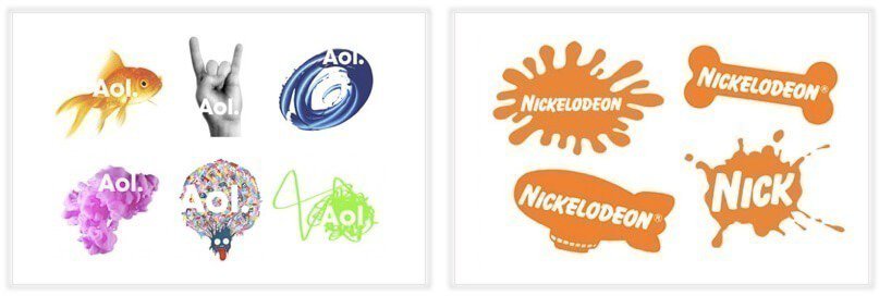
You could say dynamic marks are the new-age logo. Unlike other logos, this type of logo adapts itself to the context in which it’s used. This means that rather than having one standard font-color-text combination in your logo, these elements can change – whether on the internet or on different branding materials.  

Advantages:

You can be as creative as you want! Because there are so many mediums through which to build your brand (think responsive web pages or mobile sites, blogs, digital media, merchandise, ads – the list doesn’t end) you can modify your logo to fit any scenario or make a slew of impressions on potential customers.

Also, dynamic logos keep things interesting – your audience will be waiting on the edge of their digital seats to see what you come up with next.

What to consider:

You don’t want to lose the associative power of your logo; some of your followers may connect your brand with your colors, others may remember the shape of your icon – if these details are constantly changing, your logo may not cause the same effect as a stagnant logo would. Be mindful of the changes you make, and once again, make sure to keep your logo on message.  

Inspiration: Nickelodeon, AOL

Now It’s Your Turn!

Now that you know about the types of logos that are out there, it’s time to craft your own! Don’t worry – Tailor Brands logo designers tools have you covered.